【HarmonyOS-鸿蒙HarmonyOS实战-ArkUI组件(Swiper)】此文章归类为:HarmonyOS。
????一、Swiper
1.概述
Swiper可以实现手机、平板等移动端设备上的图片轮播效果,支持无缝轮播、自动播放、响应式布局等功能。Swiper轮播图具有使用简单、样式可定制、功能丰富、兼容性好等优点,是很多网站和移动应用中常用的轮播图插件。
2.布局与约束
Swiper是一个容器组件,如果自身尺寸没有被设置,它会根据子组件大小自动调整自身尺寸。如果开发者给Swiper设置了固定尺寸,那么在轮播过程中,Swiper的尺寸将一直保持设置的固定尺寸。如果未设置固定尺寸,Swiper会根据子组件大小自动调整自身尺寸。
3.循环播放
1 2 3 4 5 6 7 8 9 10 11 12 13 14 15 16 17 18 19 20 21 22 23 24 25 26 27 28 29 30 | @Entry
@Component
struct Index {
private swiperController: SwiperController = new SwiperController()
build() {
Swiper(this.swiperController) {
Text("0")
.width('100%')
.height('100%')
.backgroundColor(Color.Gray)
.textAlign(TextAlign.Center)
.fontSize(30)
Text("1")
.width('100%')
.height('100%')
.backgroundColor(Color.Green)
.textAlign(TextAlign.Center)
.fontSize(30)
Text("2")
.width('100%')
.height('100%')
.backgroundColor(Color.Blue)
.textAlign(TextAlign.Center)
.fontSize(30)
}
.loop(true)
}
}
|
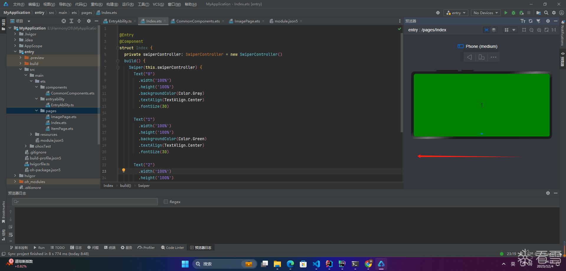
当loop为true时,在显示第一页或最后一页时,可以继续往前切换到前一页或者往后切换到后一页。如果loop为false,则在第一页或最后一页时,无法继续向前或者向后切换页面。
4.自动轮播
1 2 3 4 5 6 7 8 9 10 11 12 13 14 15 16 17 18 19 20 21 22 23 24 25 26 27 28 29 30 31 32 | @Entry
@Component
struct Index {
private swiperController: SwiperController = new SwiperController()
build() {
Swiper(this.swiperController) {
Text("0")
.width('100%')
.height('100%')
.backgroundColor(Color.Gray)
.textAlign(TextAlign.Center)
.fontSize(30)
Text("1")
.width('100%')
.height('100%')
.backgroundColor(Color.Green)
.textAlign(TextAlign.Center)
.fontSize(30)
Text("2")
.width('100%')
.height('100%')
.backgroundColor(Color.Pink)
.textAlign(TextAlign.Center)
.fontSize(30)
}
.loop(true)
.autoPlay(true)
.interval(2000)
}
}
|
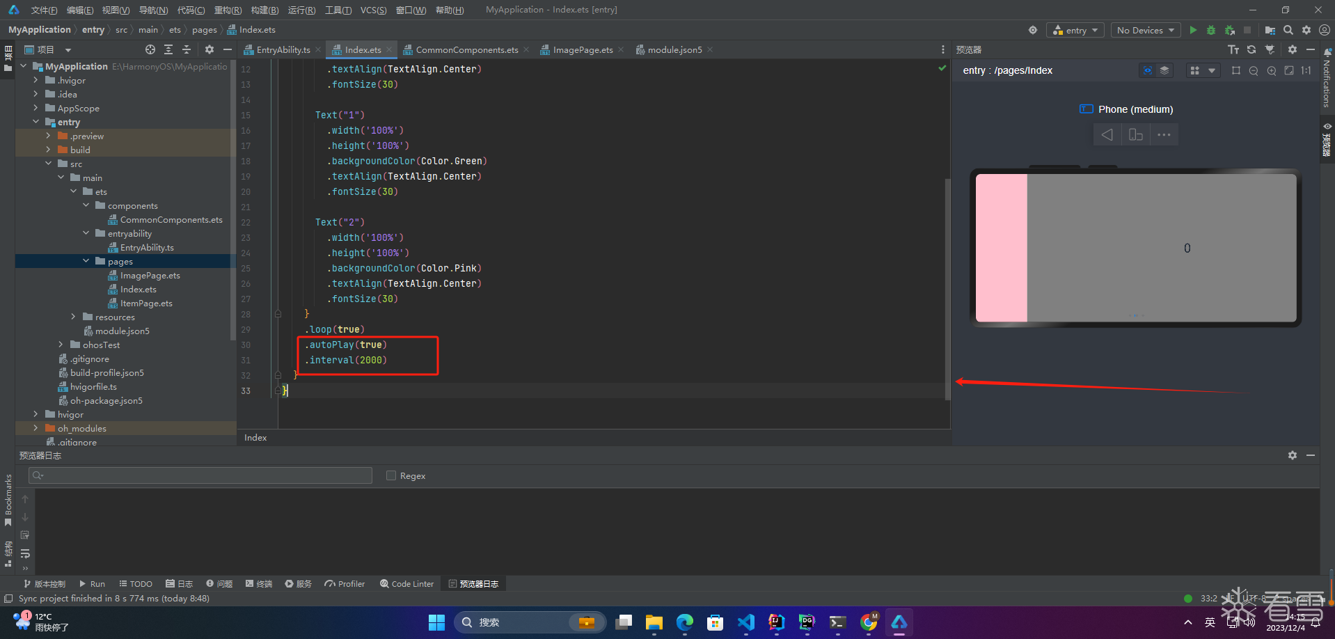
autoPlay为true时,会自动切换播放子组件,子组件与子组件之间的播放间隔通过interval属性设置。interval属性默认值为2000,单位毫秒。
5.导航点样式
1 2 3 4 5 6 7 8 9 10 11 12 13 14 15 16 17 18 19 20 21 22 23 24 25 26 27 28 29 30 31 32 33 34 | @Entry
@Component
struct Index {
private swiperController: SwiperController = new SwiperController()
build() {
Swiper(this.swiperController) {
Text("0")
.width('100%')
.height('100%')
.backgroundColor(Color.Gray)
.textAlign(TextAlign.Center)
.fontSize(30)
Text("1")
.width('100%')
.height('100%')
.backgroundColor(Color.Green)
.textAlign(TextAlign.Center)
.fontSize(30)
Text("2")
.width('100%')
.height('100%')
.backgroundColor(Color.Pink)
.textAlign(TextAlign.Center)
.fontSize(30)
}
.indicatorStyle({
size: 30,
left: 0,
color: Color.Red
})
}
}
|
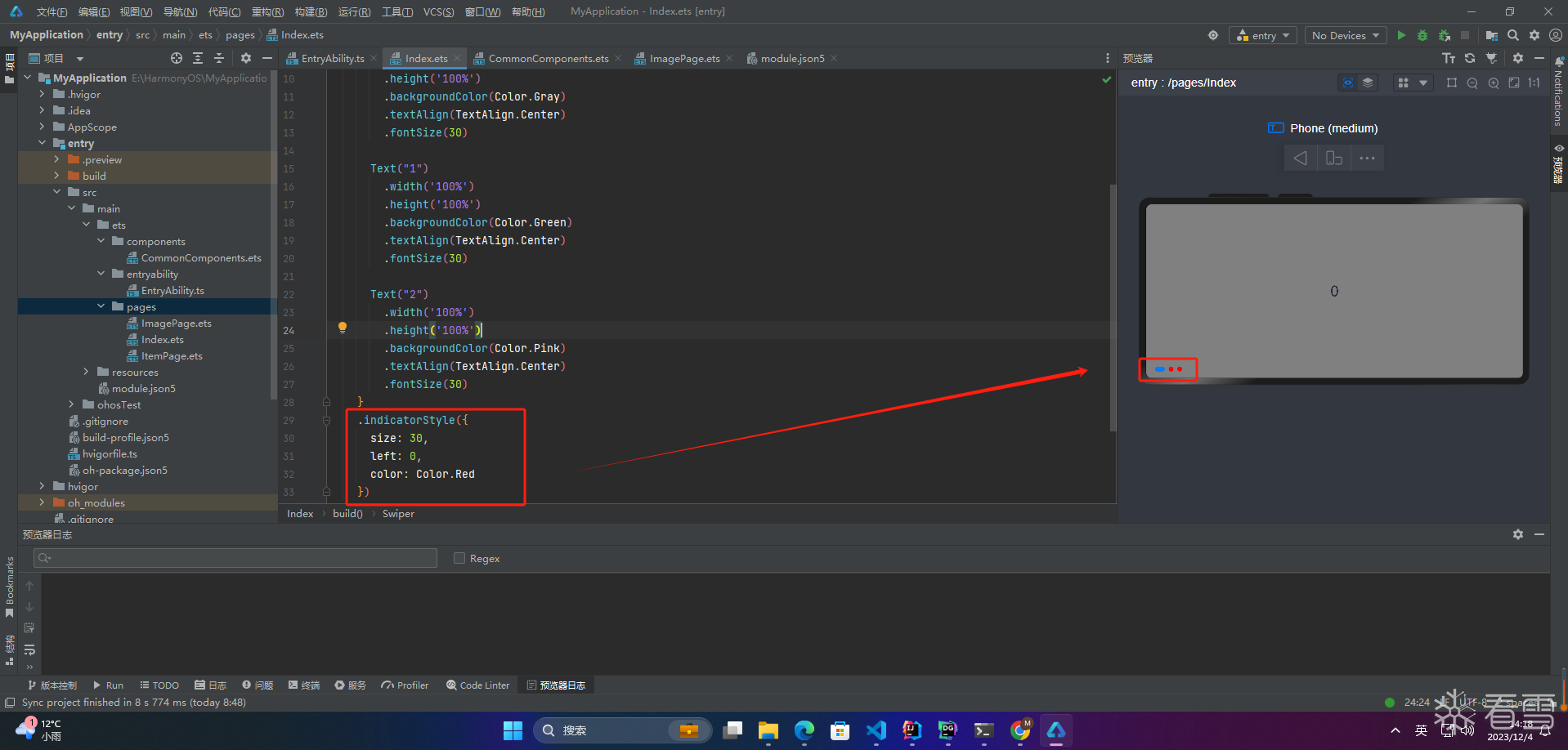
通过indicatorStyle属性,开发者可以设置导航点相对于Swiper组件上下左右四个方位的位置,同时也可以设置每个导航点的尺寸、颜色、蒙层和被选中导航点的颜色。
6.页面切换方式
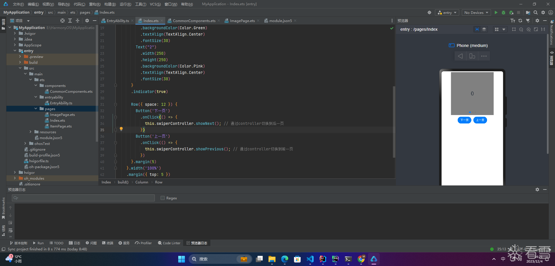
Swiper支持三种页面切换方式:手指滑动、点击导航点和通过控制器
1 2 3 4 5 6 7 8 9 10 11 12 13 14 15 16 17 18 19 20 21 22 23 24 25 26 27 28 29 30 31 32 33 34 35 36 37 38 39 40 41 42 43 | @Entry
@Component
struct Index {
private swiperController: SwiperController = new SwiperController();
build() {
Column({ space: 5 }) {
Swiper(this.swiperController) {
Text("0")
.width(250)
.height(250)
.backgroundColor(Color.Gray)
.textAlign(TextAlign.Center)
.fontSize(30)
Text("1")
.width(250)
.height(250)
.backgroundColor(Color.Green)
.textAlign(TextAlign.Center)
.fontSize(30)
Text("2")
.width(250)
.height(250)
.backgroundColor(Color.Pink)
.textAlign(TextAlign.Center)
.fontSize(30)
}
.indicator(true)
Row({ space: 12 }) {
Button('下一页')
.onClick(() => {
this.swiperController.showNext(); // 通过controller切换到后一页
})
Button('上一页')
.onClick(() => {
this.swiperController.showPrevious(); // 通过controller切换到前一页
})
}.margin(5)
}.width('100%')
.margin({ top: 5 })
}
}
|
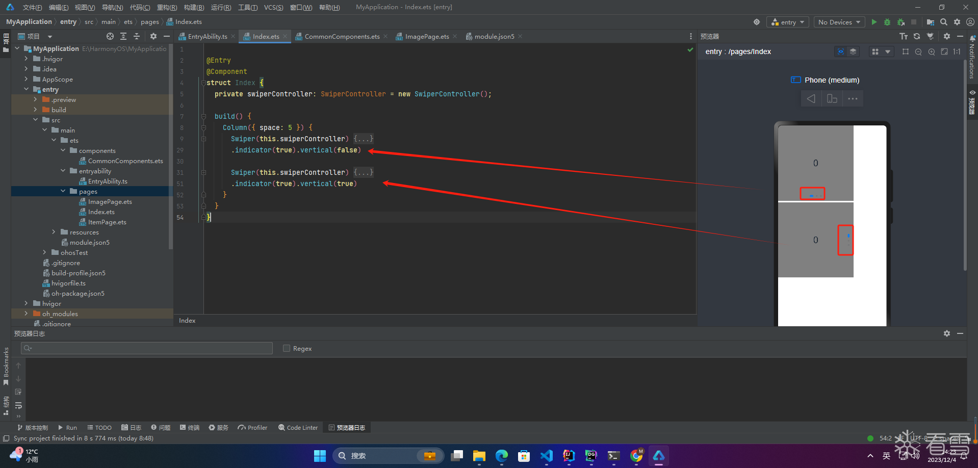
7.轮播方向
vertical为true时,表示在垂直方向上进行轮播;为false时,表示在水平方向上进行轮播。vertical默认值为false
1 2 3 4 5 6 7 8 9 10 11 12 13 14 15 16 17 18 19 20 21 22 23 24 25 26 27 28 29 30 31 32 33 34 35 36 37 38 39 40 41 42 43 44 45 46 47 48 49 50 51 52 53 | @Entry
@Component
struct Index {
private swiperController: SwiperController = new SwiperController();
build() {
Column({ space: 5 }) {
Swiper(this.swiperController) {
Text("0")
.width(250)
.height(250)
.backgroundColor(Color.Gray)
.textAlign(TextAlign.Center)
.fontSize(30)
Text("1")
.width(250)
.height(250)
.backgroundColor(Color.Green)
.textAlign(TextAlign.Center)
.fontSize(30)
Text("2")
.width(250)
.height(250)
.backgroundColor(Color.Pink)
.textAlign(TextAlign.Center)
.fontSize(30)
}
.indicator(true).vertical(false)
Swiper(this.swiperController) {
Text("0")
.width(250)
.height(250)
.backgroundColor(Color.Gray)
.textAlign(TextAlign.Center)
.fontSize(30)
Text("1")
.width(250)
.height(250)
.backgroundColor(Color.Green)
.textAlign(TextAlign.Center)
.fontSize(30)
Text("2")
.width(250)
.height(250)
.backgroundColor(Color.Pink)
.textAlign(TextAlign.Center)
.fontSize(30)
}
.indicator(true).vertical(true)
}
}
}
|
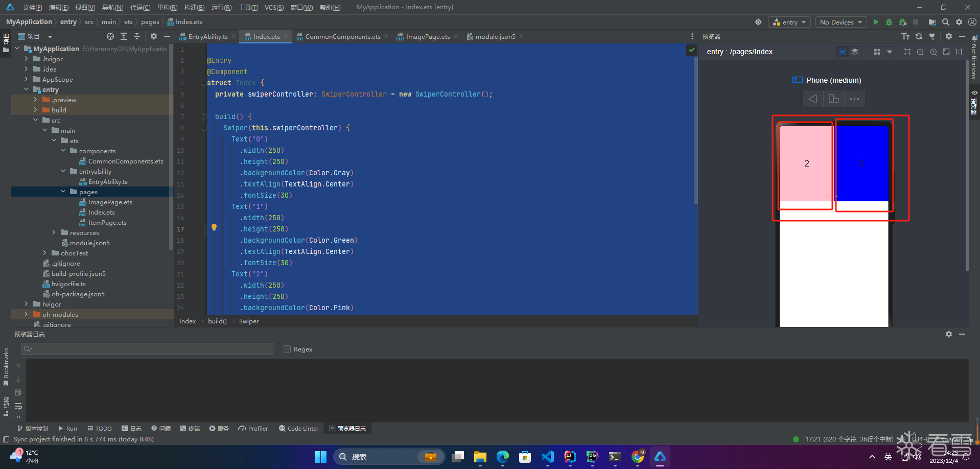
8.每页显示多个子页面
Swiper支持在一个页面内同时显示多个子组件,通过displayCount属性设置
1 2 3 4 5 6 7 8 9 10 11 12 13 14 15 16 17 18 19 20 21 22 23 24 25 26 27 28 29 30 31 32 33 34 35 36 | @Entry
@Component
struct Index {
private swiperController: SwiperController = new SwiperController();
build() {
Swiper(this.swiperController) {
Text("0")
.width(250)
.height(250)
.backgroundColor(Color.Gray)
.textAlign(TextAlign.Center)
.fontSize(30)
Text("1")
.width(250)
.height(250)
.backgroundColor(Color.Green)
.textAlign(TextAlign.Center)
.fontSize(30)
Text("2")
.width(250)
.height(250)
.backgroundColor(Color.Pink)
.textAlign(TextAlign.Center)
.fontSize(30)
Text("3")
.width(250)
.height(250)
.backgroundColor(Color.Blue)
.textAlign(TextAlign.Center)
.fontSize(30)
}
.indicator(true)
.displayCount(2)
}
}
|
????写在最后
- 如果你觉得这篇内容对你还蛮有帮助,我想邀请你帮我三个小忙:
- 点赞,转发,有你们的 『点赞和评论』,才是我创造的动力。
- 关注小编,同时可以期待后续文章ing????,不定期分享原创知识。
- 更多鸿蒙最新技术知识点,请关注作者博客:https://t.doruo.cn/14DjR1rEY

更多【HarmonyOS-鸿蒙HarmonyOS实战-ArkUI组件(Swiper)】相关视频教程:www.yxfzedu.com